54% of total eCommerce sales will come from mobile commerce sales by 2021.
(BigCommerce statistics and predictions)
By the end of 2021, global mobile eCommerce sales will reach $3.56 trillion.
(Statista’s statistics and predictions)
79% of smartphone users made an online purchase through their mobile device in the last six months from September 2021 or earlier.
(OuterBox statistics)
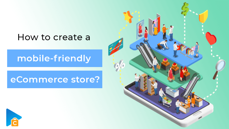
It is said that the statistics have a voice of their own. I agree with that. Mobile devices such as phones or tablets have had a great influence on each of us. And perhaps without the negative effects of the past 2 years of the Covid-19 epidemic, economic policymakers, businesses, retailers, or marketing teams also recognize the construction. Having a mobile-friendly eCommerce store becomes a vital strategy for growth. And we are here today to clarify how to optimize websites for mobile.
- Is it necessary to optimize your eCommerce storefront to be mobile-friendly?
- Ways for you to create a mobile-friendly eCommerce store
- 1. Drive customers’ attention to your website’s mobile app.
- 2. Responsive, eye-catching mobile eCommerce design
- 3. User-friendly navigation
- 4. Fast Website Loading Time
- 5. Intuitive checkout process
- 6. Optimized Images and Videos
- 7. Make your website easier to find
- 8. Phone locator
- Closing Thought
Is it necessary to optimize your eCommerce storefront to be mobile-friendly?
For those of you who are conservative, I apologize for not answering this question. Because maybe the numbers I gave above are not convincing enough?
It’s a trend, a real transformation. For many people, their mobile device is no longer just for texting, playing games, or taking pictures, it has become a tool for shopping.

Optimize your eCommerce storefront to be mobile-friendly
Many people choose to review products through an online store to get a first look at the product. That’s a way for them to eliminate unsatisfactory options and avoid wasting time like when choosing items directly at the store. Others want to take advantage of the gift cards or promotions they receive from online markets to get the best prices. And in the context of the current Covid-19 epidemic, many people choose to shop online as a way of entertainment.
The decision is still up to the customer. So why don’t we do it right the first time?
Besides, one of the benefits of a mobile-friendly eCommerce store is also a way for you to advertise to customers about your brand. More than ever, a mobile-friendly eCommerce store is the fastest way to build trust.
Read more: Breaking Down Mobile Commerce and the Best Mobile Commerce Platform
Ways for you to create a mobile-friendly eCommerce store
The process of building solutions can lead to optimized features overlapping and causing some confusion for you. The choice is still yours and depends a lot on your background. But a word of advice before we get started: if your platform is too old, a shopping cart migration tool is there to make a change.
1. Drive customers’ attention to your website’s mobile app.
When participating in the eCommerce market, there is a concept you need to pay special attention to, which is brand recognition. This means that customers know what you’re selling, what services they can provide, or simply know your business exists.
Increasing brand awareness can be done effectively through marketing strategies such as marketing through social networks, through media, or influencers and celebrities…, this is not the issue that I discuss in this article.

Making buyers aware that you’ve built an app on their mobile devices is especially effective when a connection has been built between the brand and the customer. You can make announcements in the form of posts on Facebook, Instagram, or other social platforms if your page has a steady stream of engagement.
Besides, the form of notification via text message or email is also a good way when you have obtained some information from customers through the process of collecting information from their shopping activities. Promotional videos with the appearance of influencers can also be used flexibly.
This is the mental preparation for users to have more trust as well as know the basic features and outstanding features of the application on mobile devices.
2. Responsive, eye-catching mobile eCommerce design
An eCommerce website is the face of your brand and also a way for you to respond to the interest of your shoppers. Therefore, you can bring the features of your brand into the interface of the web on mobile devices.
Besides, the arrangement of Call-to-Action buttons also needs to be scientific. The space for mobile devices cannot be as large as desktop computers. So you need to moderate the CTA buttons accordingly. Not too large to hide important web content, but not too small to cause discomfort for users when they have to zoom in to find out or access the content.
A rather small tip in this section is that these buttons should be placed in places where the user’s thumb is easy to reach. For convenience!
You can also change the content of the CTA buttons to stimulate store discovery instead of always “Buy Now” or “Add to Cart”.
The information that you want to provide to customers should also be designed to be concise and to the point.
Store owners also removed pop-ups as well as ads that can affect the buyer’s experience. I think editing yourself is also upsetting. Although you know, advertising will bring your store additional revenue streams, but that is not the value that the eCommerce process is about. Google will also “grade poorly” your site and show your site less often if you don’t fix this.
3. User-friendly navigation
Along with ensuring a visual experience, your store must also run smoothly. As I analyzed above, the space for your store on mobile devices is very small, so customers will focus on the important elements of your website such as Product Categories, Programs, etc. Deals, Blogs, Support.
You should make sure these options are designed to be easy to see and easy to find. And the optimal position can be in the upper left or right corner of the interface. From here implementing a pull-down list will be intuitive. You can use branching diagrams if you want to help buyers get into the details when searching for a product.
You should also opt for eCommerce platforms with responsive designs that automatically resize your website content to fit the user’s screen size. This is great because you won’t have to worry about the website interface encountering errors like garbled or not displayed at all. This will encourage users to stay on the site longer.
To test the friendliness of the platform, you can use a Mobile Simulator Tool to simulate the entire process a customer goes from just visiting your eCommerce store to checkout to get the product.
4. Fast Website Loading Time
There’s nothing more frustrating than waiting for a web page to load. The ideal time is under two seconds, while three seconds is still acceptable. Just a second can make a huge difference and send your customers off to the glee of your competitors.
There are many ways to improve this. If you are using an old eCommerce platform, migration with the help of shopping cart migration tools would be an option. Old and less updated platforms will find it difficult to keep up with today’s new technology applications.
You can shorten load times by optimizing images or the amount of content displayed on your website, using caching plugins, and implementing AMP protocols to increase processing performance.
5. Intuitive checkout process
Baymard surveys indicate that cumbersome checkout is one of the main reasons why customers abandon their shopping cart.
It takes a lot of work to get your customers to the checkout stage of a sales funnel and having a less-than-optimal checkout process can cost everything.
One of the most common mistakes made by online stores is asking shoppers to sign up for an account at checkout. Oh my God! How heavy and time-consuming! With a lot of information to share and many customers paying special attention to the right of information security after many information leaks have confused public opinion.
“Paying as a Guest”, “Login via Google, Facebook…” and “Register for a new account”. That is, you give shoppers the freedom to make their own choices and still be able to skillfully gather relevant information. Auto filling forms for returning customers can also help save time and make the overall user experience more user-friendly. Trusted payment gateways such as Paypal, Google Wallet, or Apple Pay should also be prioritized to create a sense of trust for customers as well as eliminate confusion over difficult credit card information. The conversion rate will increase quite a lot if you do this way.
Another interesting tip is the “Quick Buy” dip button that helps shoppers “score the winning goal of the game” when they see their favorite item. This is a way to limit unnecessary touchpoints for customers who already know what they will buy.
6. Optimized Images and Videos
One of the weaknesses of eCommerce is that customers have to receive information about products quite passively.
Images and videos related to your product help users understand your product. The optimal choice will be 6 images with 1 to 2 videos for each product. However, this can also significantly affect website load times if the images are too large for a high resolution or the video is too heavy for its length. There are a few add-ons that you can use to test and guide your image editing to suit your store.

Optimized Images and Videos
Example: We have Pixlr which helps you to align images based on your page width.
Or Patrick Sexton of varvy.com/mobile for some helpful tips to improve your mobile eCommerce site.
The side images that provide the perspective when the user experiences the real thing (through the image worn by the model) also need to provide the user with information about the material as well as its performance in reality.
One of my favorite choices when watching videos is that the producer speaks up about the ideas and messages he sends through the product or it can also be the experience and feelings of previous buyers.
7. Make your website easier to find
This is something that few store owners notice if they want to have a mobile-friendly eCommerce store.
Your services and products may also appear in rival stores. During a market full of similar products (the most recognizable difference is probably only the brand name), 90% of customers will click on the first website that appears in the search results. by Google. And very few people take the trouble to click through to the second page to search for the products. This is based on how Google ranks SEO. You need to signal to Google that your page is properly formatted for mobile and that it is optimal.
You should prioritize using specific, popular, and searchable keywords related to your product.
Another added tip would be to use rich snippets (structured data markup) wisely. This is the additional information displayed in the search results such as user reviews, prices, recipes, facts, software, videos, and articles. This will hit the psychology of careful customers if they have the habit of carefully selecting the website before clicking.
8. Phone locator
GPS is one of the great features a phone has to offer.
And when designing a mobile-friendly eCommerce store this is the first thing you need to think about. Phone locator helps users find the closest store to their current location. They can go there to directly order the product or choose the most preferred delivery location.
Closing Thought
If you want to create a mobile-friendly eCommerce store, the best way is to put yourself in the customer’s shoes and try to buy something from your website. Those experiences along with sincere suggestions from customers will help your website become more and more perfect. Besides, it’s the 21st century, and you have great support for advanced technologies to achieve that.
Don’t hesitate to share with us if you are having difficulty related to eCommerce!
Thanks for reading!